Colour is communicating something in every room you walk into, but most professionals never think about it deliberately.
I don’t mean metaphorically, but literally. Visual information, such as colour and shape, is processed faster than words. Your brain is drawing conclusions before anyone has consciously registered anything about you.
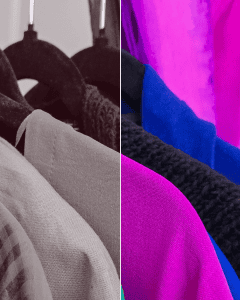
Imagine walking into a meeting where everyone is dressed in greyscale… It feels flat, muted, low energy. Now add colour back in and the information changes. You don’t consciously think about it, but it’s happening.
Most professionals think carefully about what they say and how they say it. Very few apply that same intentionality to what colour is communicating on their behalf.
It’s not as simple as “wear red to look confident”
This is where it gets more interesting. Those principles exist – wear red to project confidence, wear blue to build trust – and there’s science behind how colour affects perception and even physiological response. But colour doesn’t work in isolation from the person wearing it.
A warm red on someone with a cool undertone can undermine the very confidence it’s supposed to project – creating a sallow cast that reads as tired or even unwell, rather than authoritative and confident. The same red on someone it harmonises with does exactly the work you want it to do.
So there are two layers to using colour well professionally:
Layer one – choosing a colour that communicates what you intend.
Layer two – making sure the specific shade works with your natural colouring rather than against it.
Most people never get to the second layer.
Why this matters more than you might think
I spent over a decade working in evidence-based industries – life sciences and clinical research – where what you could demonstrate mattered more than how you presented it. I understand the instinct to let the work speak for itself.
But I also understand now that the work doesn’t always speak for itself; people have to be paying attention first. Colour is an important tool to help earn that attention, and it’s a more precise tool than most people realise.
Ready to find out what your colours are really doing?
A colour analysis session is where we start. In under 2 hours at my Nottingham studio, we work out exactly which shades are working for your natural colouring – and which ones are quietly working against you.